01
ELITE
A refined serif wordmark shaped by contrast, elegance, and a premium culinary tone.
Chapter 02 · Identity Archive 03
Identity Explorations
2019 — 2020
This collection brings together a range of identity marks created between 2019 and 2020.
Each project required a different balance between concept, form, typography, cultural context, and practical application.
Together, the marks document a period of experimentation and growing clarity—moving between expressive illustration, geometric abstraction, bilingual identity structures, and contemporary wordmarks.




The Collection
The collection spans different sectors and visual approaches, from typographic identities and architectural symbols to illustrated characters and expressive food brands.
Rather than following one visual formula, each mark was developed to respond to its own name, audience, category, and communication needs.

03 · Typographic Identities
Several identities in the collection are driven primarily by typography.
The letterforms become the main source of personality—using proportion, spacing, contrast, and custom details to create a distinctive voice while maintaining clarity and scalability.
A refined serif wordmark shaped by contrast, elegance, and a premium culinary tone.
A contemporary technology-focused wordmark using a visual shift within the initial letterform.
A custom mark connecting the agency initials with movement and optical rhythm.
View Full Case Study04 · Structural Symbols
These marks use architectural and geometric structures to translate the brand idea into a compact visual symbol.
Arches, entryways, layered forms, and controlled proportions create identities that feel stable, recognizable, and adaptable across bilingual and physical applications.
A bilingual mark built around the visual language of a gateway and passage.
A geometric architectural symbol combining layered forms with a structured bilingual identity.
A compact symbol combining an architectural opening with a fresh contemporary food identity.
05 · Expressive & Character Marks
Other marks rely on illustration, character, color, and expressive form to create an immediate emotional connection.
These identities were designed to feel memorable and approachable while remaining clear across packaging, signage, apparel, and digital use.
An illustrated cultural mark built around a recognizable portrait and expressive line language.
View Full Case Study Full Case StudyA fashion identity transforming royal inspiration into a contemporary illustrated character.
View Full Case StudyA playful fast-food identity combining a chef character, bold typography, and a utensil detail.
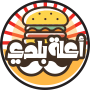
A bold illustrated food identity combining Arabic lettering with a circular burger composition.
Reflection
This collection reflects a stage of growth shaped by working across different industries, audiences, and visual challenges.
The marks do not share one style. Their connection comes from the process behind them: understanding the idea, identifying the strongest visual direction, and reducing it into a form that can remain clear, memorable, and useful.
A visual archive of experimentation becoming method.