Chapter 02 · Case Study 02
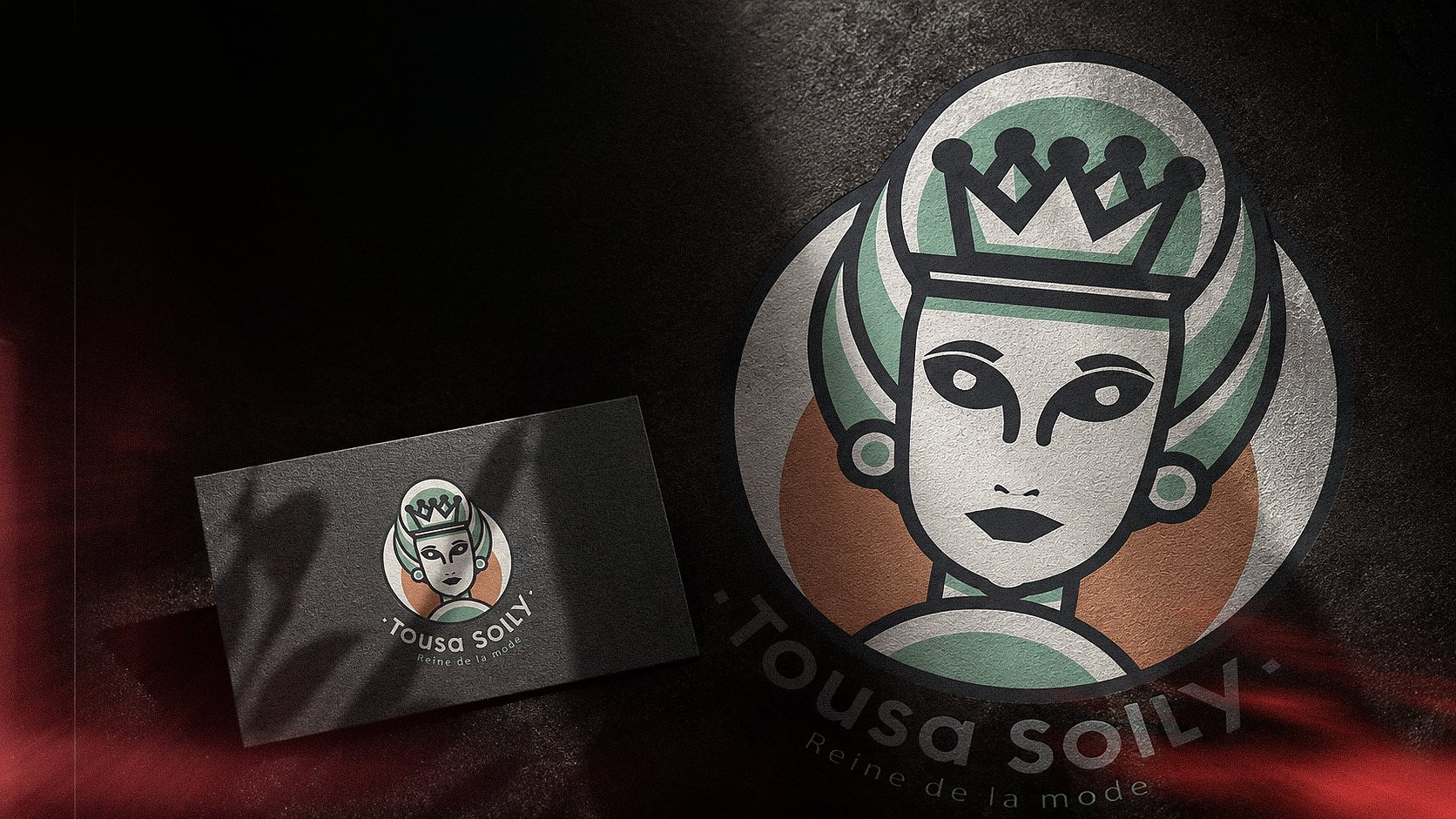
TOUSA SOLLY
Reine de la mode
A contemporary brand identity created for a French women’s fashion store, combining royal inspiration with a fresh and accessible visual character.
- Year
- 2019
- Category
- Fashion Brand Identity
- Role
- Brand Identity Designer
- Scope
- Logo Design · Visual System · Pattern Design · Brand Applications
02 · Brand Context
BRAND CONTEXT
MODERN FASHION.
ROYAL CHARACTER.
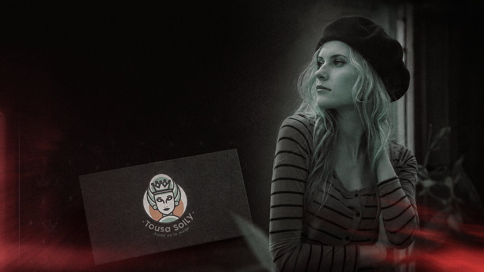
Tousa Solly is a French women’s fashion store offering modern and accessible fashion through an online-focused retail experience.
The brand required an identity that felt feminine and distinctive while remaining contemporary, approachable, and suitable for everyday fashion.
03 · Inspiration
INSPIRATION
FROM ROYAL HERITAGE
TO MODERN IDENTITY.
The identity was inspired by Marie Antoinette as an iconic symbol of French royalty, elegance, and fashion.
The creative process began by studying the recognizable elements of her portrait—the crown, hairstyle, facial structure, and symmetrical silhouette—then reducing them into a simplified contemporary emblem.
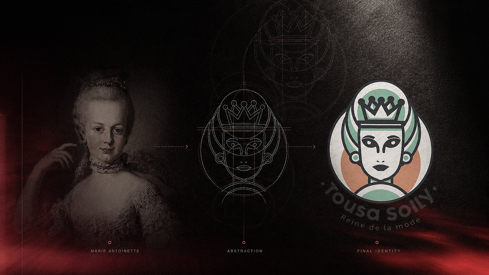
Marie Antoinette as the central source of inspiration.
Reducing historical details into simplified geometric forms.
A distinctive illustrated character representing modern royalty.
04 · Logo Development
LOGO
DEVELOPMENT
SIMPLIFYING CHARACTER.
PRESERVING IDENTITY.
The logo was developed through a controlled process of visual simplification.
The portrait’s main characteristics were translated into clean geometric lines, while the crown became the central expression of confidence, elegance, and leadership.
The final mark balances personality and symmetry, allowing it to remain recognizable across different sizes, materials, and applications.
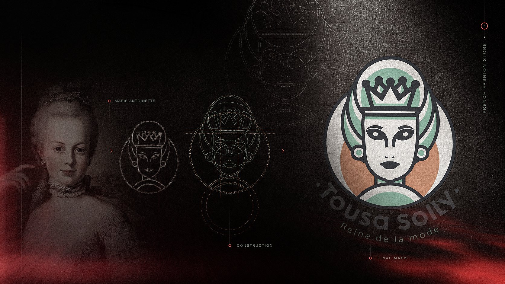
Identifying the most recognizable facial and royal elements.
Building a balanced and consistent illustrated structure.
A clear and memorable symbol with a distinctive fashion character.
05 · Visual System
VISUAL SYSTEM
A SOFT PALETTE
WITH A STRONG CHARACTER.
The visual system extends the royal concept through a fresh and feminine color palette, structured typography, and a repeating crown pattern.
Soft mint creates a contemporary and approachable mood, while peach introduces warmth and femininity. Dark graphite provides contrast, clarity, and visual stability.
Together, these elements form a consistent identity that can adapt across both printed and digital brand touchpoints.
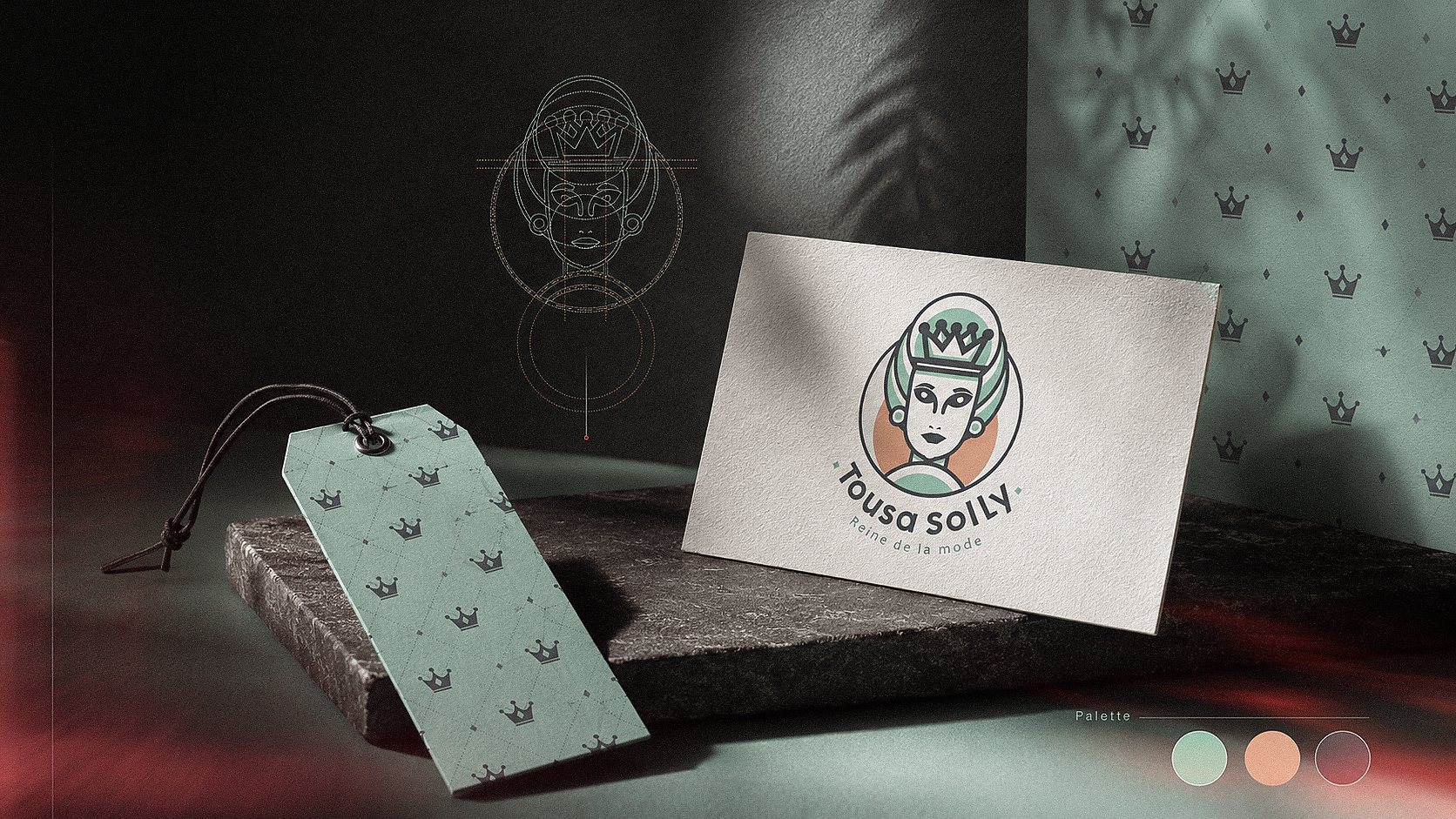
A supporting graphic element derived from the royal concept.
Fresh, feminine, and balanced.
Consistent identity across essential printed materials.
06 · Brand Applications
BRAND APPLICATIONS
DESIGNED TO LIVE
BEYOND THE LOGO.
The identity was designed to move naturally from packaging to fashion products while maintaining the same visual character.
Shopping bags, apparel, product tags, and fabric labels use the logo, palette, and crown pattern as one connected system.
Each application adapts to its material and scale without losing the identity’s consistency or recognizability.
A flexible fashion identity built around one strong and memorable character.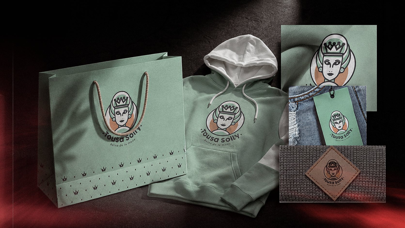
A recognizable branded experience from the first interaction.
The identity adapted directly to fashion products.
A clear and consistent extension of the visual system.
A simplified mark designed for small-scale production.
Result
A FLEXIBLE FASHION IDENTITY
BUILT AROUND ONE MEMORABLE CHARACTER.
The final system combines a distinctive illustrated mark, a soft contemporary palette, and flexible applications that maintain consistency across physical and digital touchpoints.