Chapter 02 · Case Study 04
VAN GOGH
MUSEUM
Identity & Exhibition Campaign
2020
A conceptual identity and exhibition campaign developed for the Van Gogh Museum, translating the artist’s recognizable portrait, expressive linework, and visual energy into a contemporary visitor-facing system.
- Year
- 2020
- Category
- Museum Identity / Exhibition Campaign
- Role
- Brand Identity Designer
- Scope
- Identity Concept · Portrait Mark · Graphic Pattern · Exhibition Promotion · Visitor Materials · Environmental Applications
AN ICONIC ARTISTIC LEGACY.
REINTERPRETED AS A CONTEMPORARY EXPERIENCE.
The project explores how the visual memory of Vincent van Gogh can extend beyond individual paintings and become a coherent identity system.
The concept combines an illustrated portrait mark, a line pattern inspired by expressive brush movement, a distinctive color palette, and a flexible promotional system designed for exhibition, event, and visitor touchpoints.
02 · Brand Context
BRAND
CONTEXT
FROM ARTISTIC RECOGNITION
TO VISITOR EXPERIENCE.
Vincent van Gogh’s work is immediately recognizable through color, texture, movement, and emotional intensity.
The challenge was to develop a contemporary identity that could remain connected to that artistic legacy while functioning clearly across museum communication, exhibition promotion, tickets, badges, stationery, environmental graphics, and branded materials.
03 · Creative Concept
CREATIVE
CONCEPT
PORTRAIT.
MOVEMENT.
MEMORY.
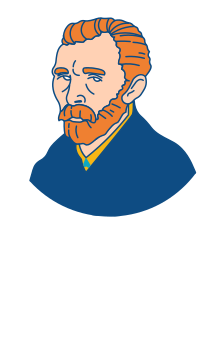
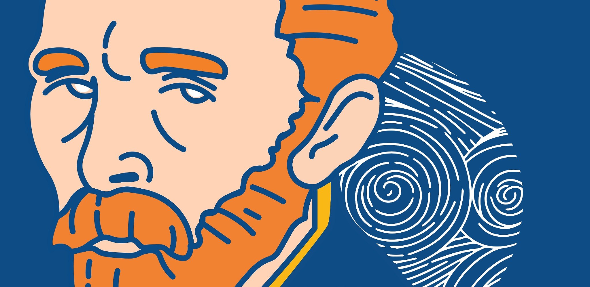
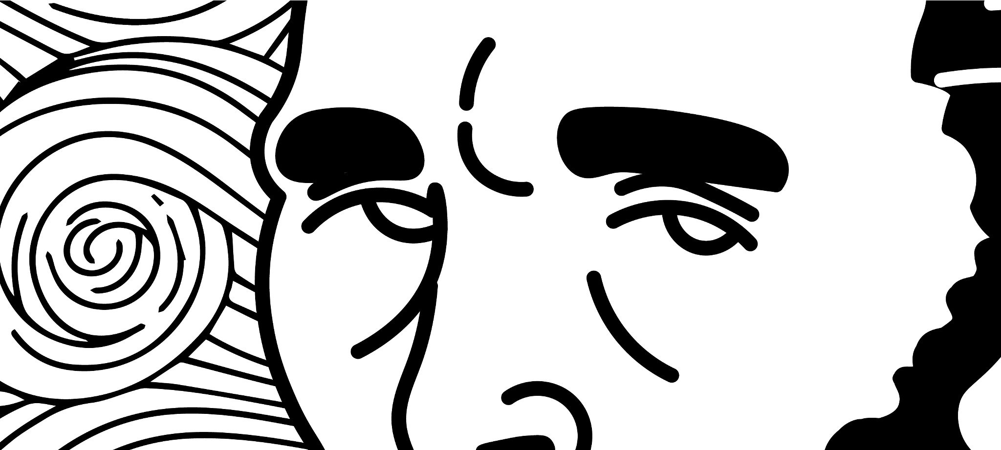
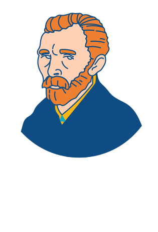
The identity begins with an illustrated portrait of Van Gogh, reduced into clear contemporary linework while preserving his most recognizable features.
Behind the portrait, a circular field of flowing lines references the energy and rhythm associated with his brushwork.
This combination creates a symbol that works on two levels: a recognizable cultural portrait and a flexible contemporary mark.
- 01
Portrait
A simplified illustrated representation creating immediate recognition.
- 02
Line Movement
A supporting visual language inspired by expressive motion and swirling painted textures.
- 03
System
A flexible combination of portrait, wordmark, pattern, and color that adapts across multiple scales.
04 · Logo & Graphic System
LOGO &
GRAPHIC SYSTEM
ONE PORTRAIT.
MULTIPLE EXPRESSIONS.
The identity was developed as a family of coordinated marks rather than one fixed lockup.
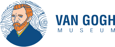
The portrait can operate independently at small scales, while horizontal and stacked wordmarks support signage, promotional layouts, visitor materials, and institutional communication.
The line pattern extends the visual language beyond the logo and creates continuity across backgrounds, frames, and large-format applications.
Portrait / Compact Mark
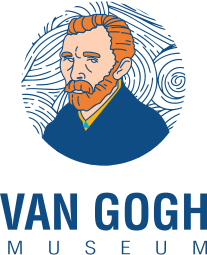
Dark / Color Version
Horizontal Lockup
Line Pattern
05 · Typography & Color
TYPOGRAPHY
& COLOR
CLARITY WITH
EXPRESSIVE CONTRAST.
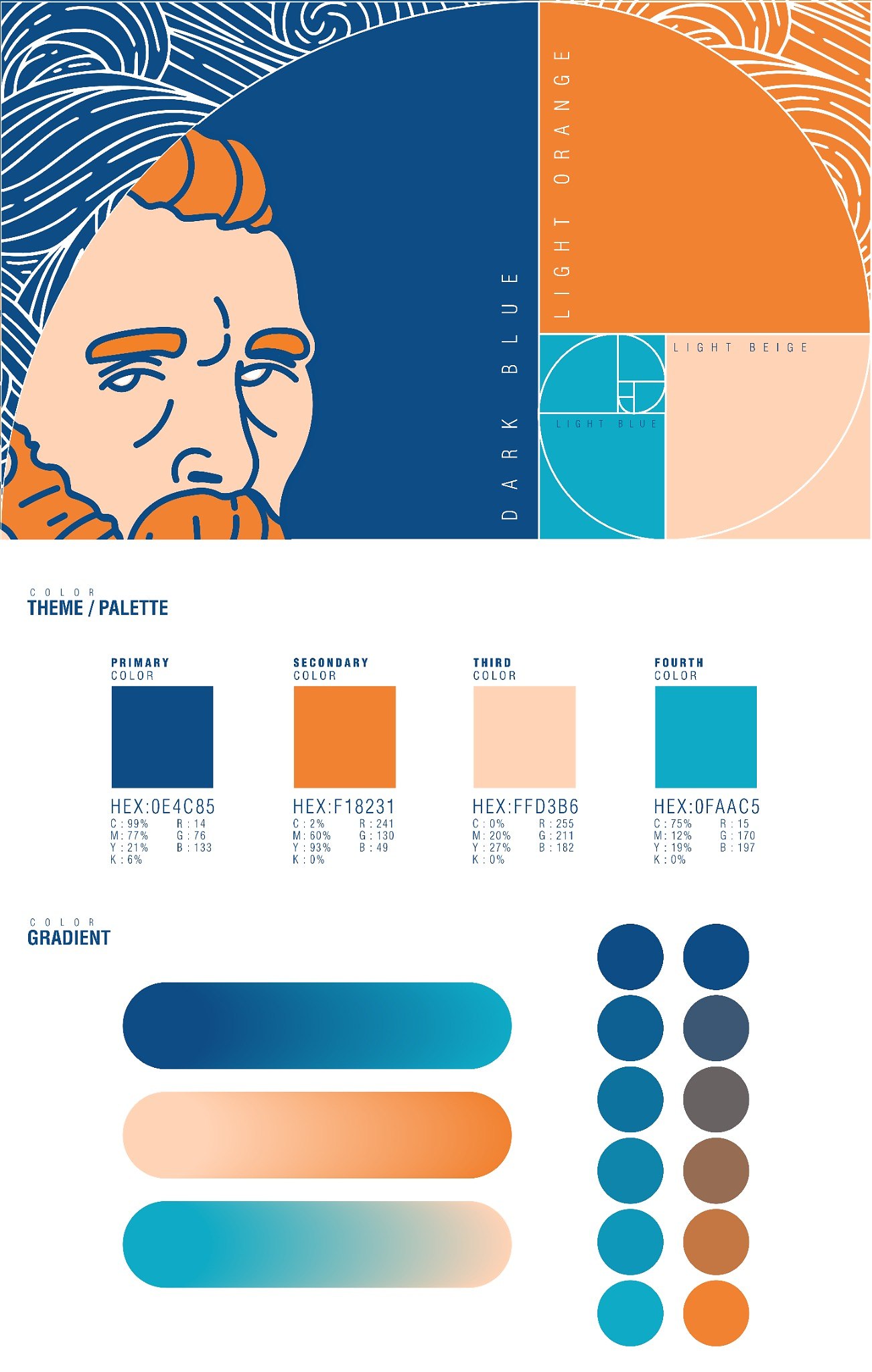
The visual system balances strong condensed typography with a palette rooted in deep blue, vivid orange, warm beige, and light blue.
The typography provides contemporary structure and high visibility, while the palette connects the identity to warmth, emotion, movement, and cultural recognition.
Helvetica
Bold CondensedHeadlines and key campaign moments.Helvetica Condensed
Light / RegularBody copy, captions, supporting information, and visitor communication.Dark Blue#0E4C85
Light Orange#F18231
Light Beige#FFD3B6
Light Blue#0FAAC5
06 · Exhibition Promotion
EXHIBITION
PROMOTION
THE IDENTITY
IN PUBLIC VIEW.
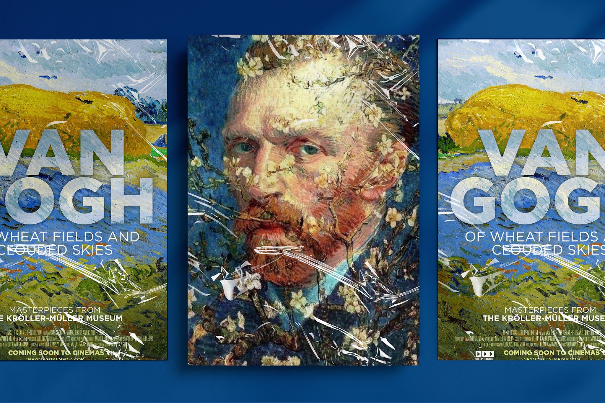
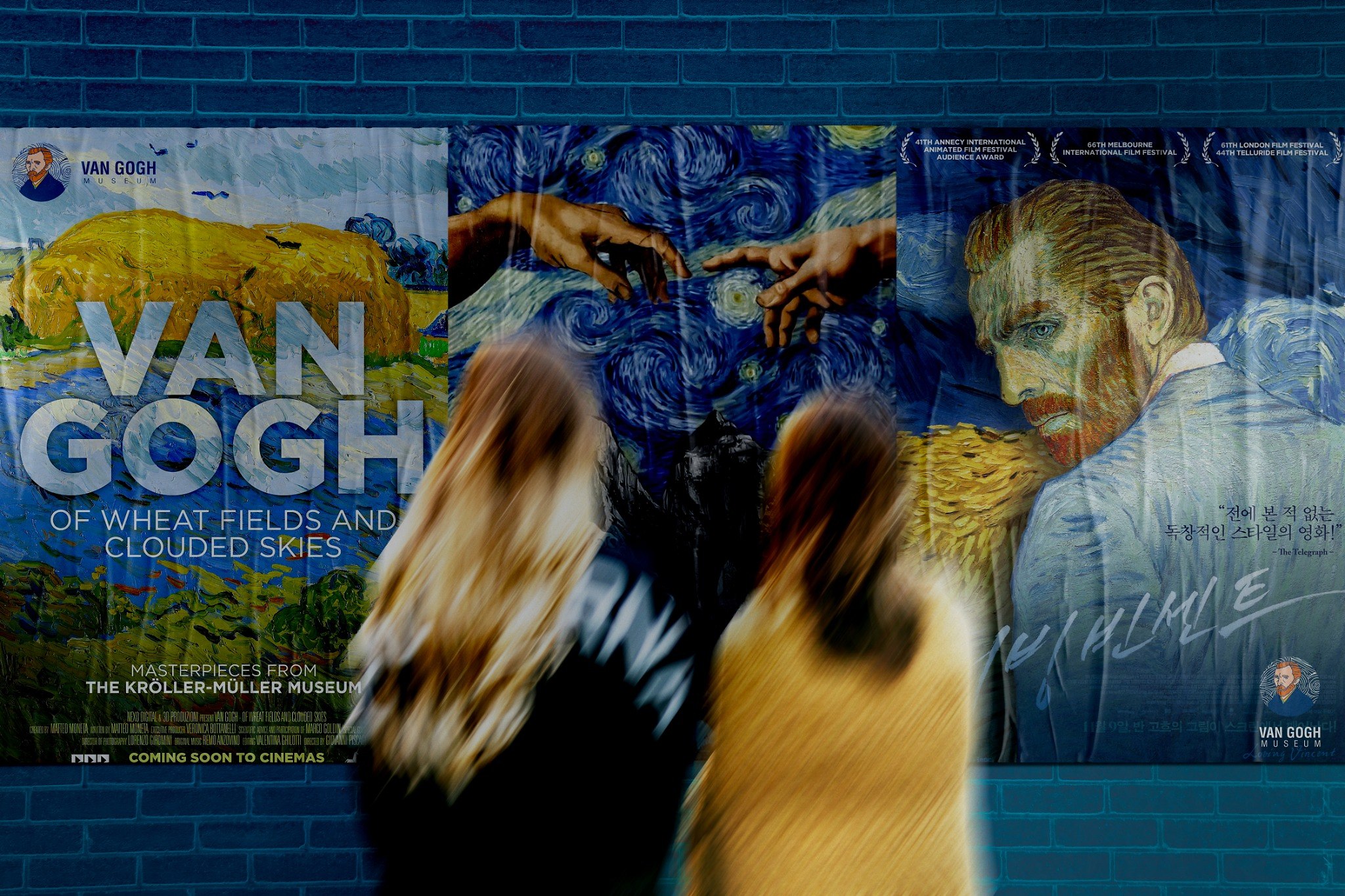
The exhibition campaign uses large painted imagery, bold condensed typography, and the museum identity to create promotional materials with strong visual recognition.
The campaign allows the artworks to remain central while the identity provides a consistent institutional frame.
07 · Visitor & Event Materials
VISITOR &
EVENT MATERIALS
A CONNECTED EXPERIENCE
ACROSS EVERY TOUCHPOINT.
The system extends into the practical materials that shape the visitor experience.
Tickets, badges, business cards, stationery, and event communication use the same portrait, line pattern, typography, and color system to maintain continuity from first contact to on-site participation.
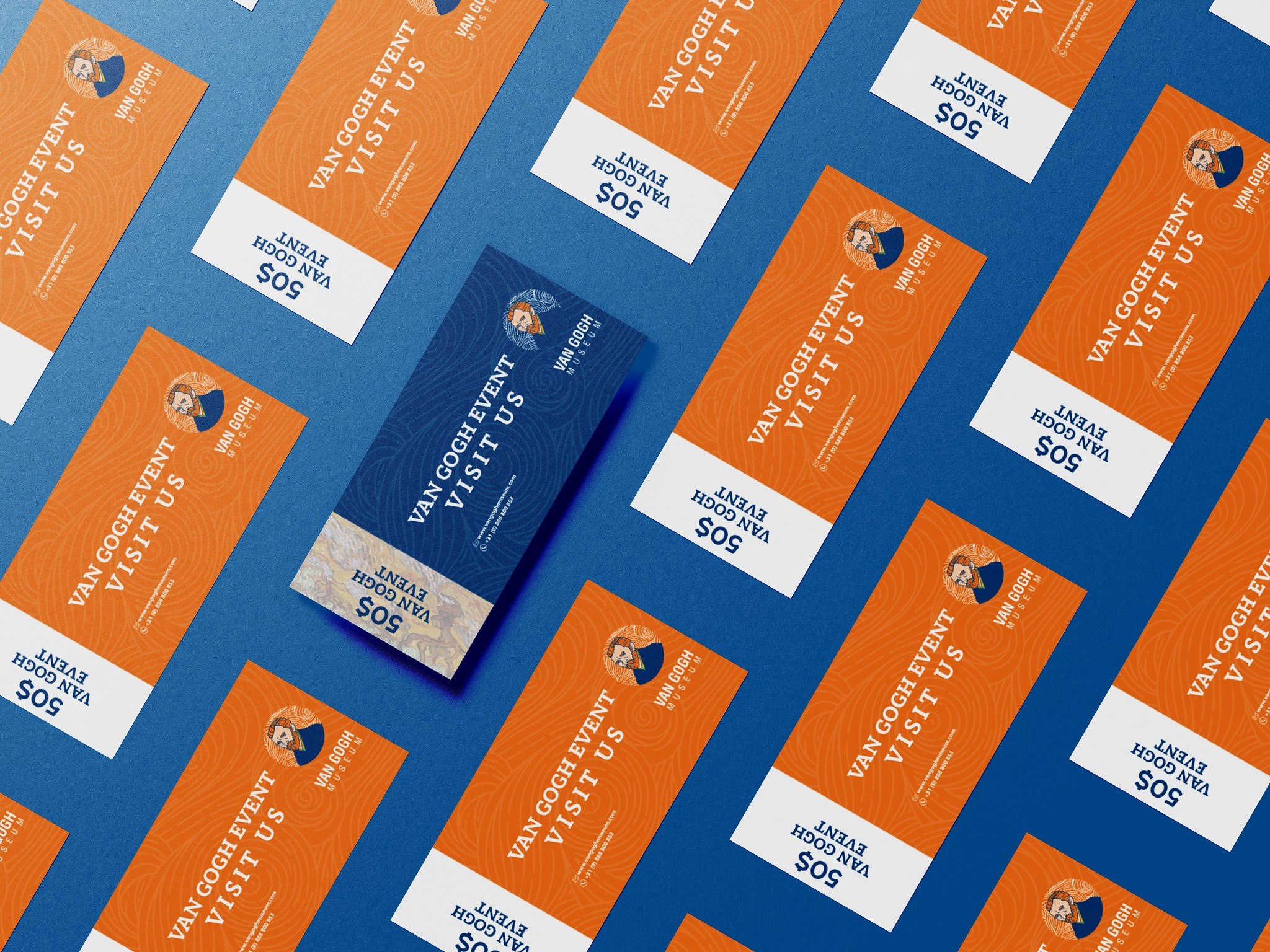
01Event Tickets
A high-contrast ticket system designed for clear hierarchy and fast recognition.
02Visitor Access
Badge and access materials using the portrait and pattern at a compact scale.
03Institutional Materials
A consistent extension of the identity across stationery and contact pieces.
08 · Environmental Application
ENVIRONMENTAL
APPLICATION
FROM CAMPAIGN
TO PHYSICAL SPACE.
The campaign was designed to retain impact at architectural scale.
The posters and identity elements create a recognizable exhibition presence while allowing the artwork and visitor movement to remain central to the environment.
09 · Branded Extension
BRANDED
EXTENSION
A VISUAL SYSTEM
BEYOND THE EXHIBITION.
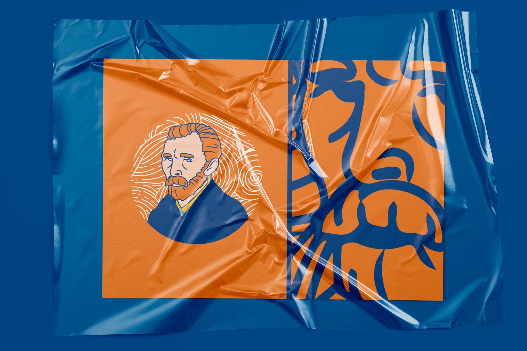
The portrait mark and graphic pattern were adapted to branded materials, demonstrating how the system could continue beyond promotional communication.
The bold color relationship and large-scale portrait treatment allow the identity to remain recognizable even when the full wordmark is not present.
Branded MaterialA large-scale portrait and pattern application using the identity’s primary blue and orange contrast.
Result
A CULTURAL IDENTITY
BUILT AROUND RECOGNITION,
MOVEMENT, AND EXPERIENCE.
The final system combines a recognizable portrait, an expressive line pattern, a structured typographic hierarchy, and a versatile promotional language.
Together, these elements create a conceptual museum identity capable of moving across exhibition promotion, visitor communication, environmental graphics, and branded extensions while maintaining one clear visual character.
An iconic artistic legacy translated into a connected contemporary system.Chapter 02 Complete
THE EVOLUTION
BECAME DIRECTION.
From OP ART Agency to TOUSA SOLLY, Selected Logos & Marks, and Van Gogh Museum, this chapter documents the shift from experimentation toward clearer systems, stronger concepts, and a more intentional visual voice.
GROWTH BEGINS BEYOND THE COMFORT ZONE.Continue the Journey