Chapter 02 · Case Study 01
OP ART AGENCY
Visual Identity Case Study
Brand Identity Design / 2018
OP ART Agency is a visual identity project created for a contemporary advertising agency seeking a bold, memorable, and flexible brand presence.
The goal was to build an identity that reflects creativity, clarity, and strong visual impact while remaining professional and scalable across different communication platforms.
The concept was inspired by the language of optical art, using dynamic movement, contrast, and rhythm to create an engaging identity system.
The result is a modern brand that combines a distinctive logotype, a strong graphic pattern, and an adaptable application system across digital and printed touchpoints.
- Year
- 2018
- Category
- Visual Identity
- Role
- Brand Identity Designer
- Client
- OP ART Agency
- Scope
- Logo Design · Visual Identity · Social Media System · Print Applications · Brand Mockups
02 · Identity System Overview
IDENTITY SYSTEM
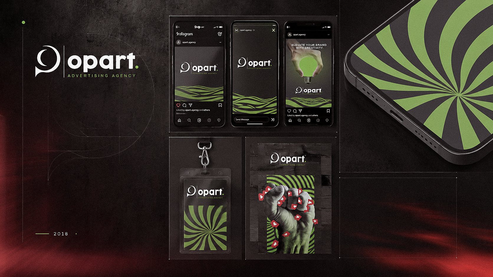
The identity system was developed around three main components: the logo, the optical pattern, and a high-contrast color palette.
Together, these elements create a unified visual language that is expressive, contemporary, and instantly recognizable.
The brand was designed to feel energetic and visually striking without losing clarity.
This balance allows OP ART Agency to communicate both creativity and professionalism across different brand touchpoints.
03 · Graphic Language
GRAPHIC LANGUAGE
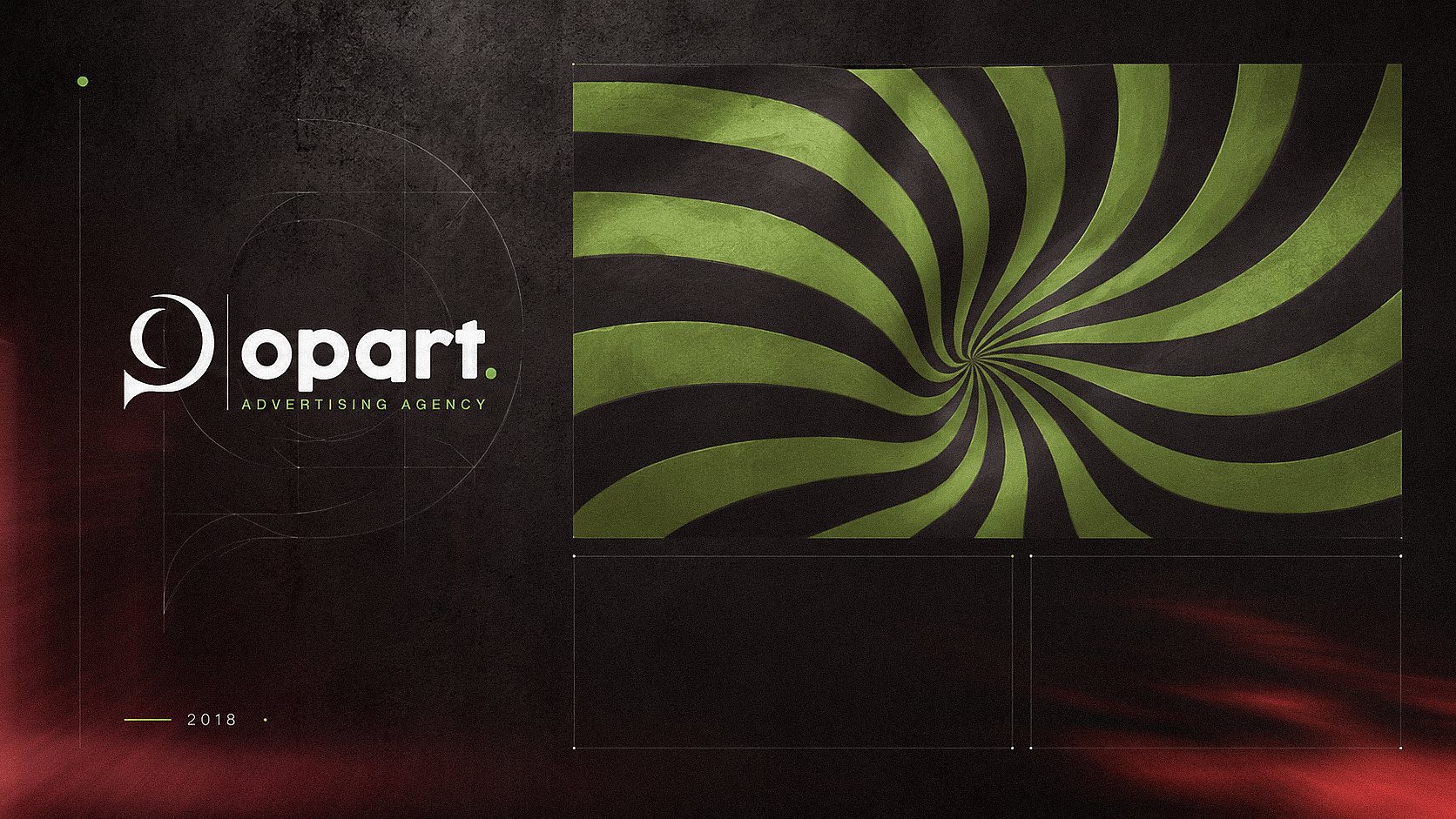
The graphic pattern is a central element of the visual identity.
Inspired by op art, it creates movement, visual depth, and a strong sense of rhythm.
This element gives the brand a distinctive signature that can be applied across backgrounds, layouts, and promotional materials.
The pattern works as more than decoration.
It supports brand recognition, reinforces the creative direction, and helps unify the identity across multiple formats.
04 · Logo Concept / Construction
LOGO CONCEPT
O + P = Brand Mark
The logo was developed by combining the initials O and P into one unified mark.
The result is a simple yet distinctive symbol that reflects the agency’s name while carrying a contemporary and memorable form.
Its circular flow creates a sense of movement, directly connecting the mark to the visual logic of optical art.
At the same time, the structure remains clean and balanced, allowing the logo to perform effectively across different sizes and applications.
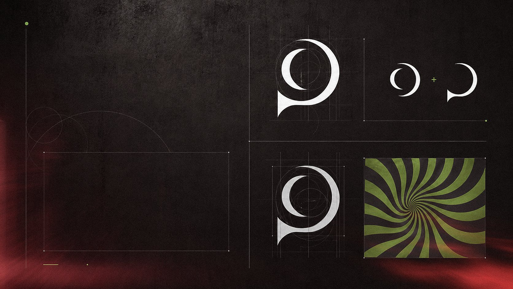
The symbol is built on a geometric structure to ensure balance, consistency, and scalability.
Optical movement and visual rhythm inspired the identity system.
05 · Brand Applications
BRAND APPLICATIONS
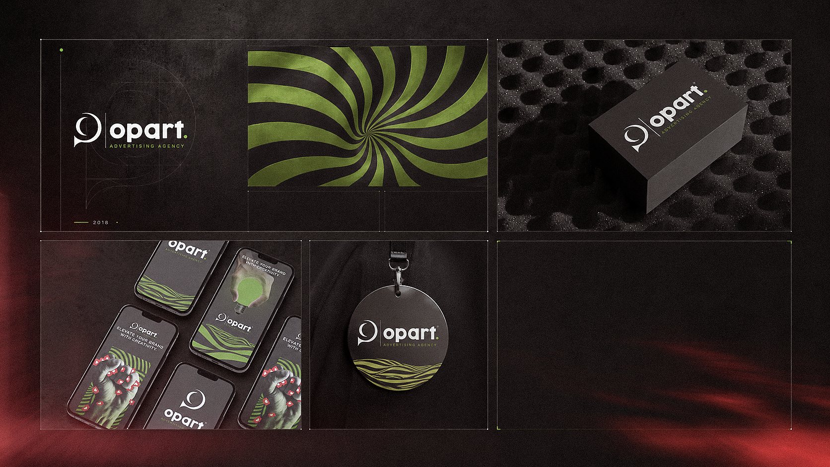
The final identity was applied across a range of physical and promotional touchpoints to demonstrate how the brand performs in real-world contexts.
From printed materials to digital and branded applications, the system maintains a clear and recognizable presence.
The combination of the logo, optical pattern, and bold contrast helps the identity stand out across applications while staying consistent with the agency’s creative personality.
Result
A BOLD AND ADAPTABLE IDENTITY
BUILT THROUGH MOVEMENT,
CONTRAST, AND CLARITY.
The final system combines a distinctive O and P mark, an optical graphic language, and flexible applications that maintain a clear and recognizable presence across digital and printed touchpoints.