Chapter 03 · Case Study 01 · 2023
FALCON SPORTSWEAR
BUILT FOR MOTION.
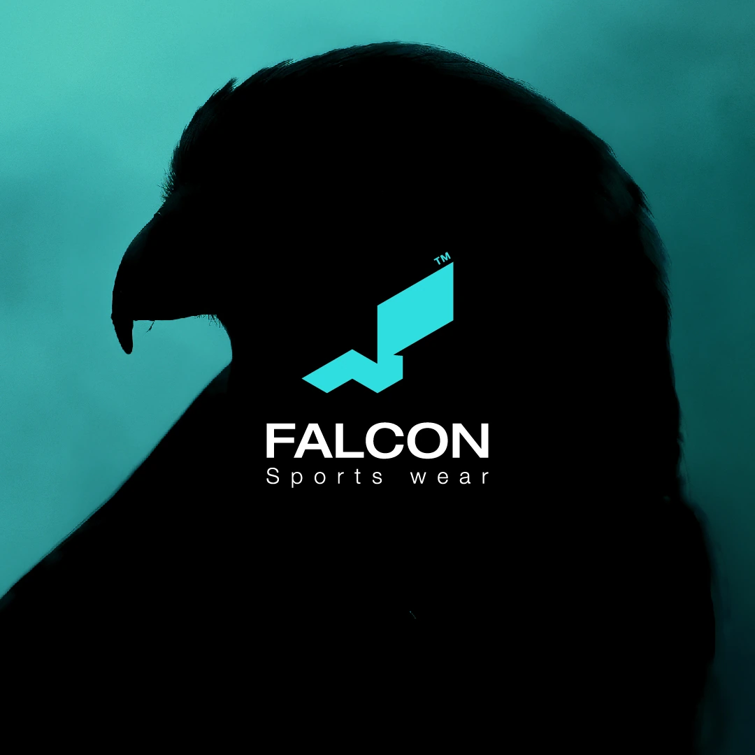
A dynamic sportswear identity created to express speed, strength, and forward movement through one sharp and memorable visual signature.
- Year
- 2023
- Category
- Brand Identity
- Scope
- Logo Design · Visual Identity · Art Direction · Campaign Applications · Apparel & Retail Touchpoints
02 · Brand Overview
PERFORMANCE MADE ACCESSIBLE.
Falcon was developed for an active audience seeking sportswear that combines style, comfort, durability, and accessible value. With products manufactured in-house, the brand aimed to maintain stronger quality control while serving a broad market and preparing for expansion from online sales into a physical retail presence.
The challenge was to create an identity that felt energetic and contemporary without becoming visually complicated or disconnected from the everyday customer.
A performance-driven identity designed for real movement and everyday use.
ACTIVE · DURABLE · ACCESSIBLE · CONTEMPORARY
03 · Key Mark & Logo System
A COMPACT SIGNATURE FORWARD.
The identity system is built around a compact mark and a direct wordmark. The symbol carries the brand’s energy at small scales, while the full lockup provides a clear commercial signature across apparel, retail, packaging, and digital communication.
COMPACT · DIRECT · RECOGNIZABLE · ADAPTABLE

THE FALCON FORMED THE LETTER F.
The symbol was built around a simplified falcon captured in flight and rotated to create a clear sense of acceleration.
Its dominant wing forms the letter F, connecting the animal directly to the brand name while preserving the compact silhouette of a recognizable sports mark.
Sharp edges communicate speed and precision, while the falcon represents strength, agility, and controlled movement.
FALCON → FLIGHT → F LETTER → MOTION

04 · Visual System & Campaign
A SYSTEM BUILT AROUND MOTION.
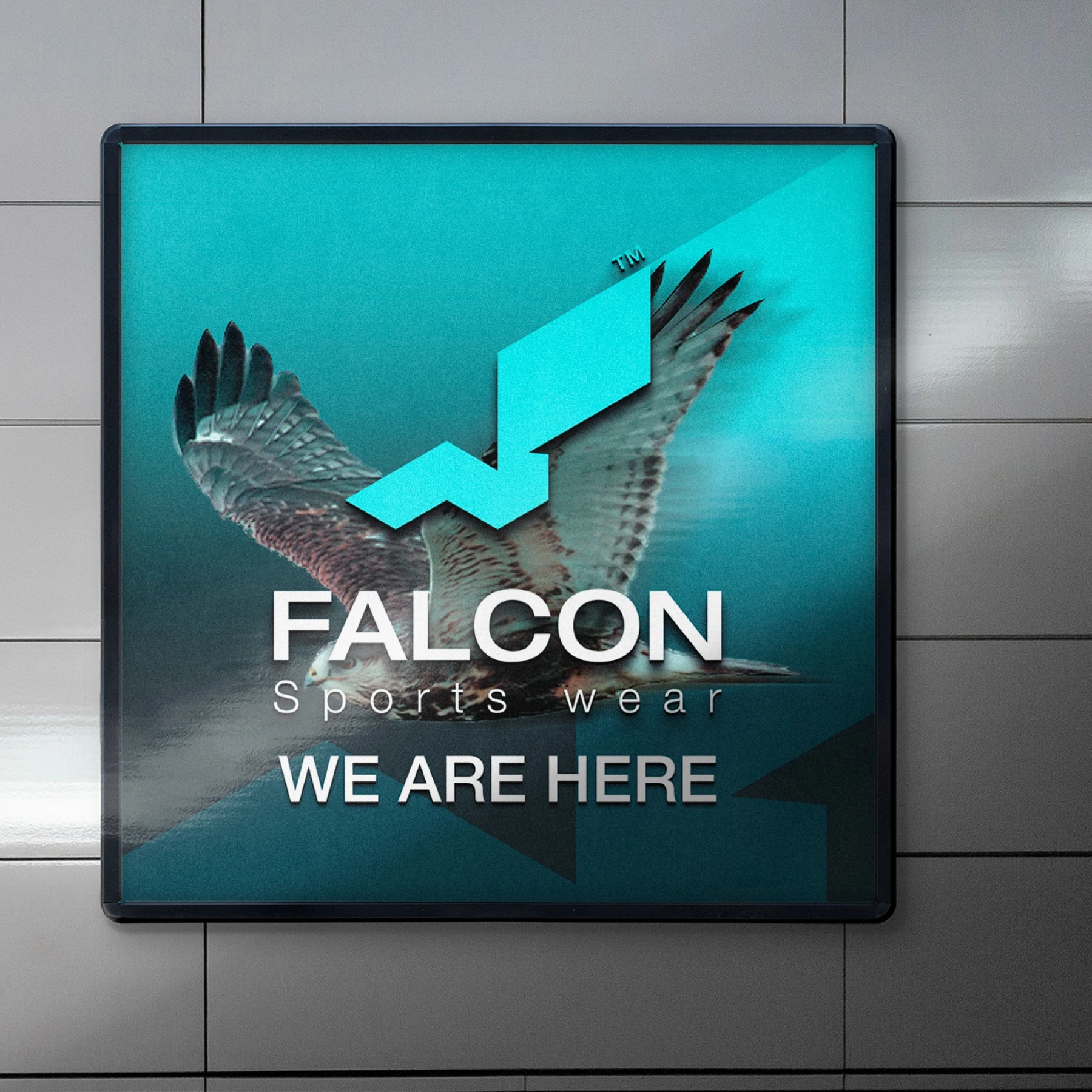
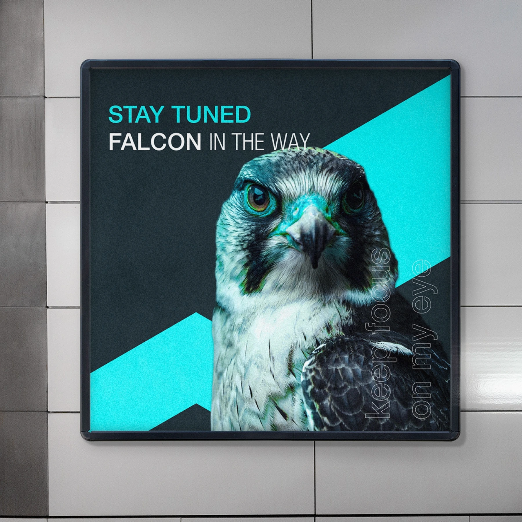
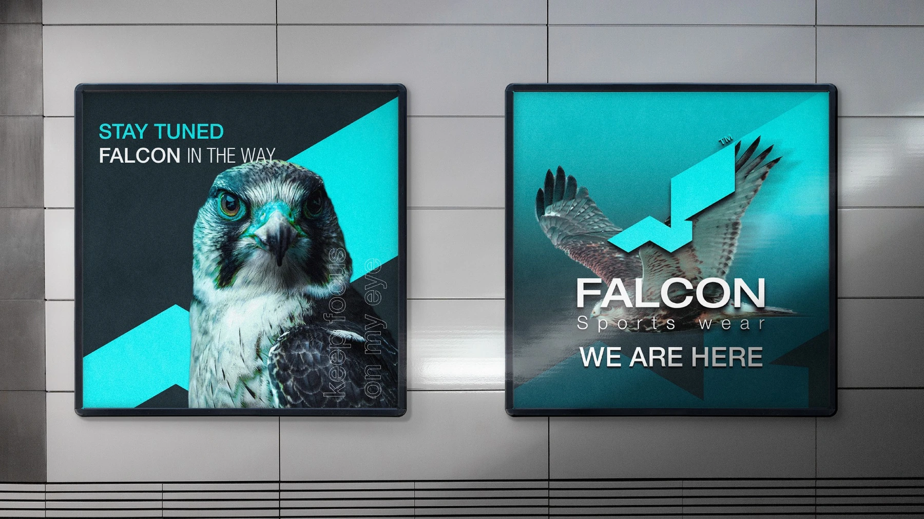
The campaign language extends the sharp geometry of the mark through bold cyan planes, dark fields, cropped falcon imagery, and focused typographic statements. Each composition preserves the same sense of direction and speed while adapting to different formats.
STRENGTH · SPEED · AGILITY · PRECISION
05 · Applications & Mockups
FROM IDENTITY TO RETAIL EXPERIENCE.
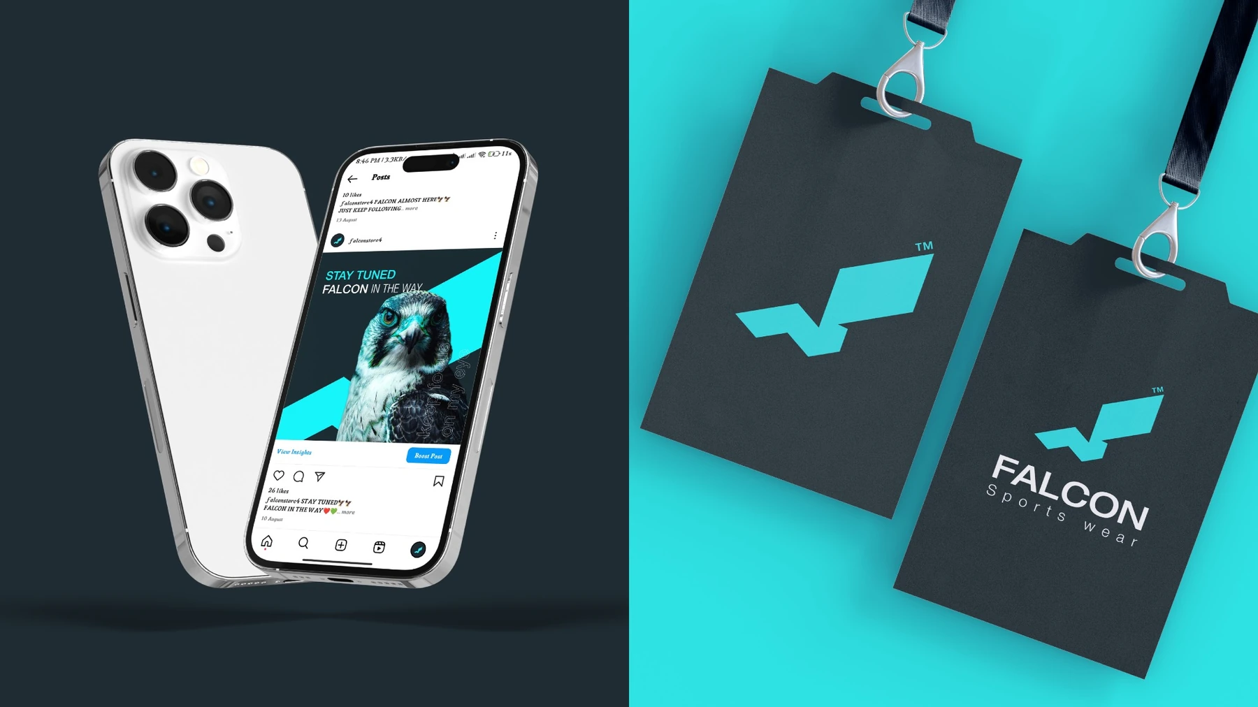
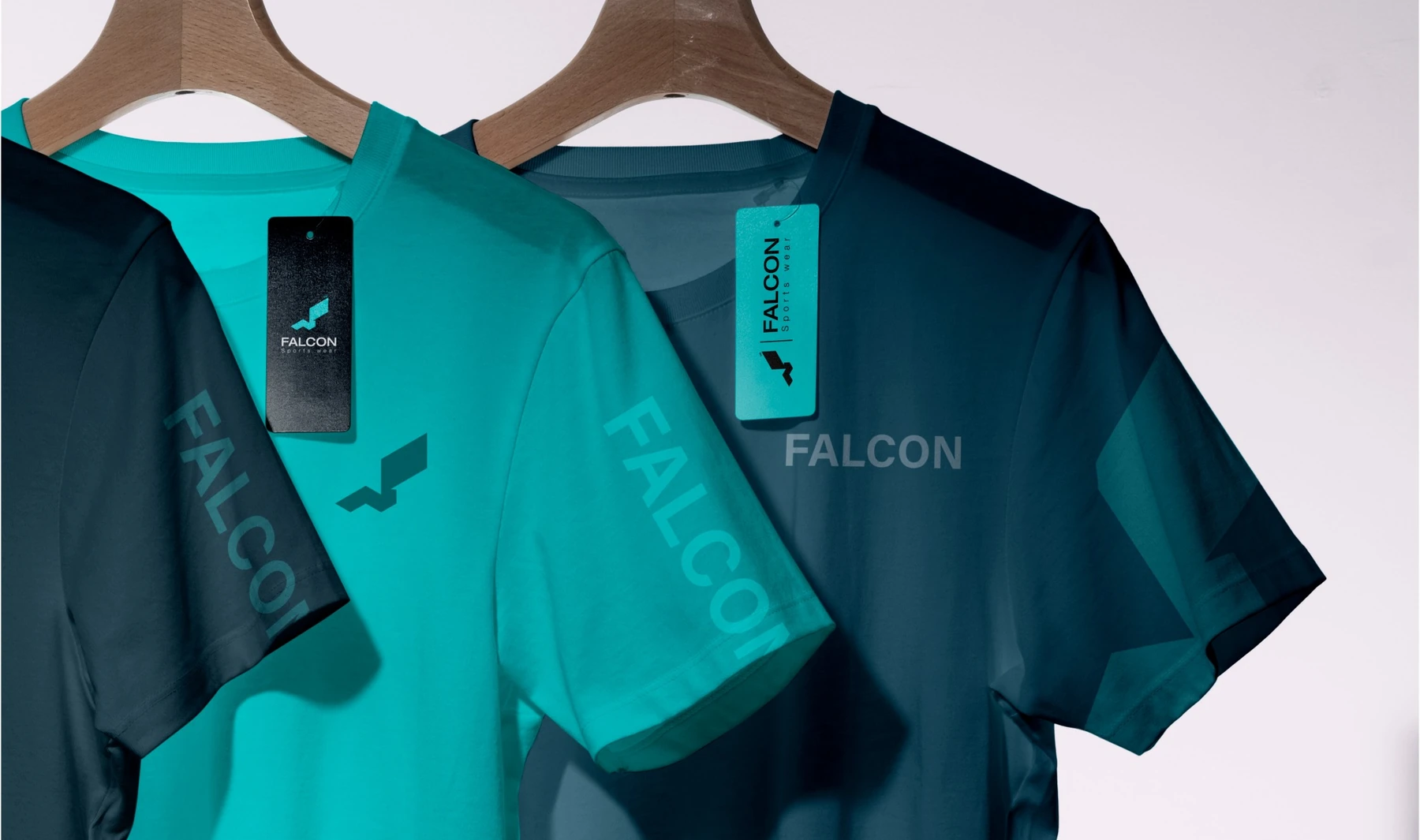
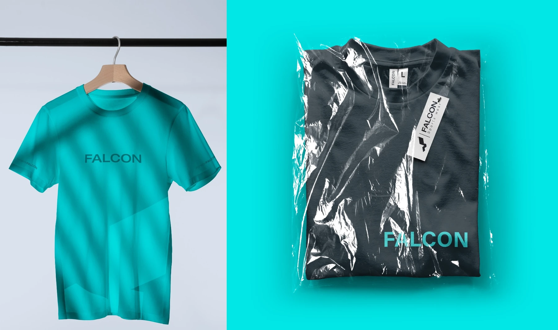
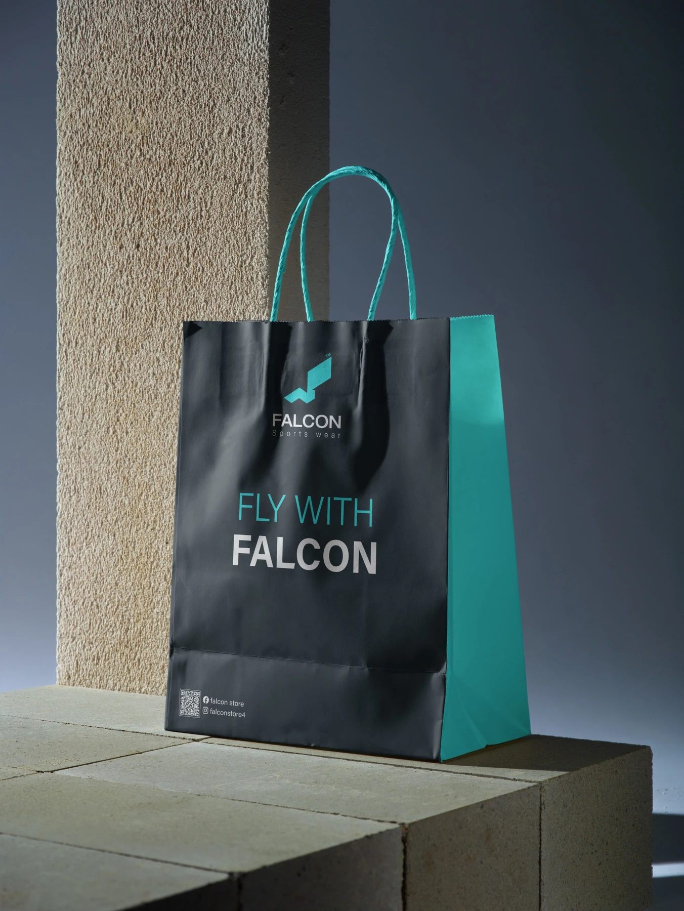
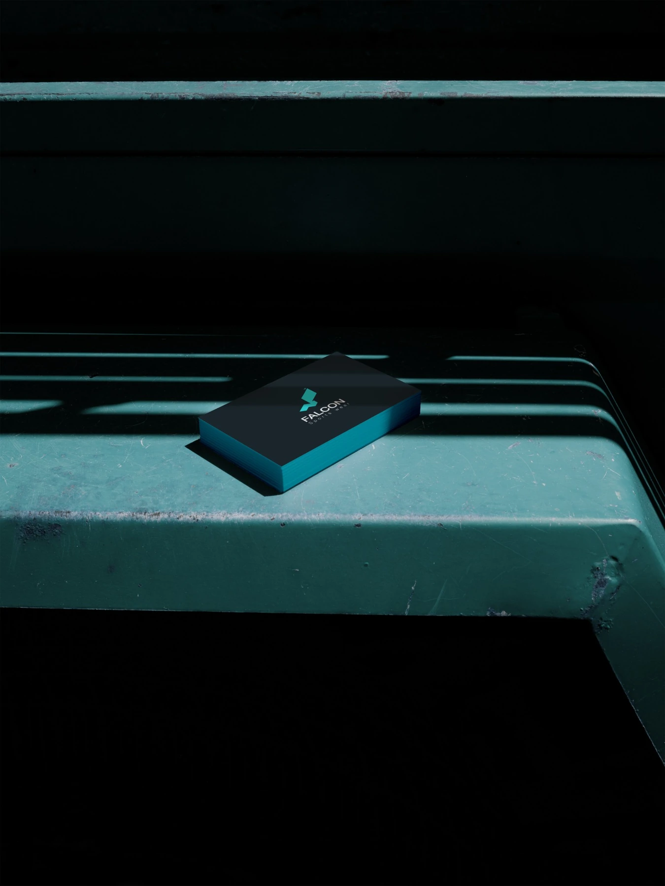
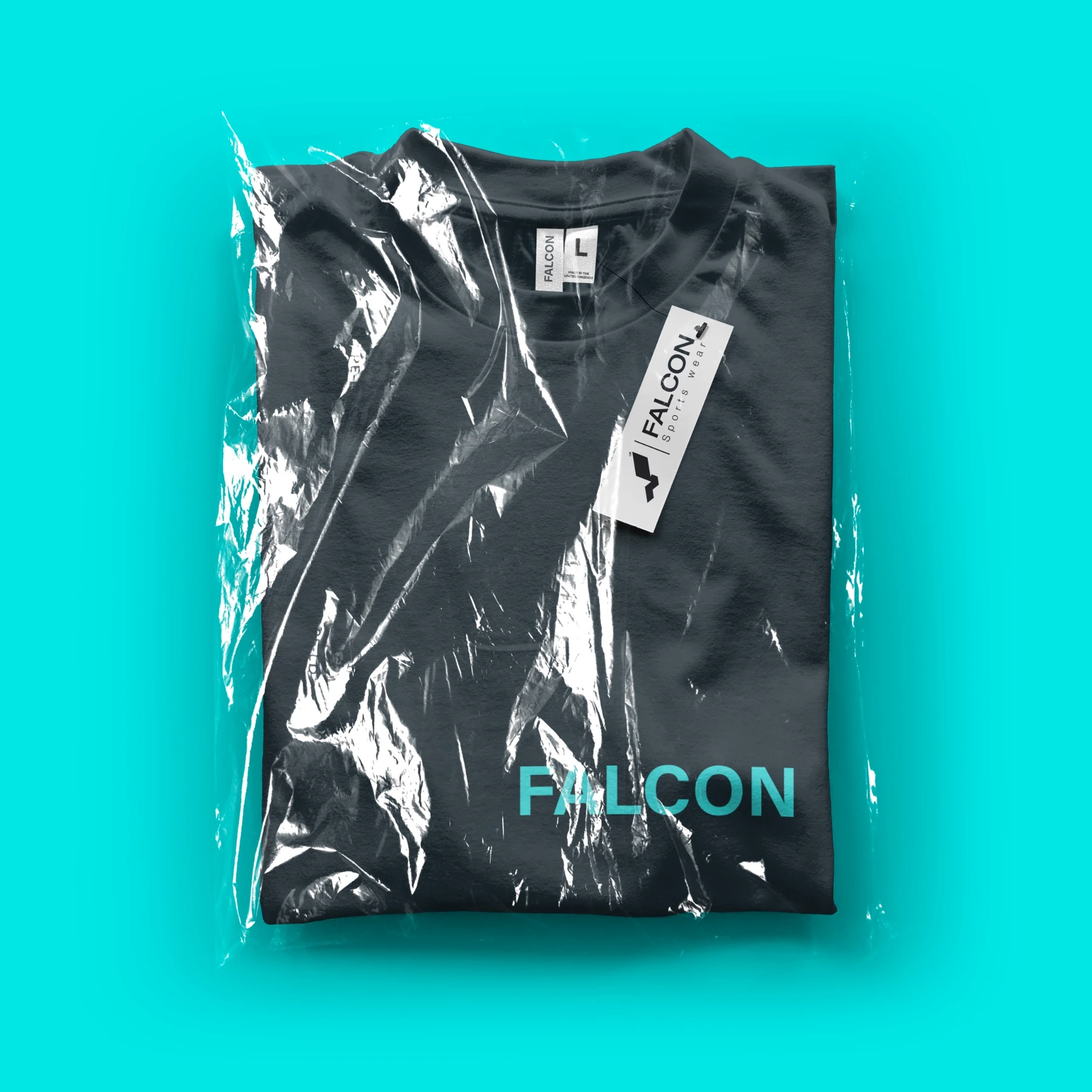
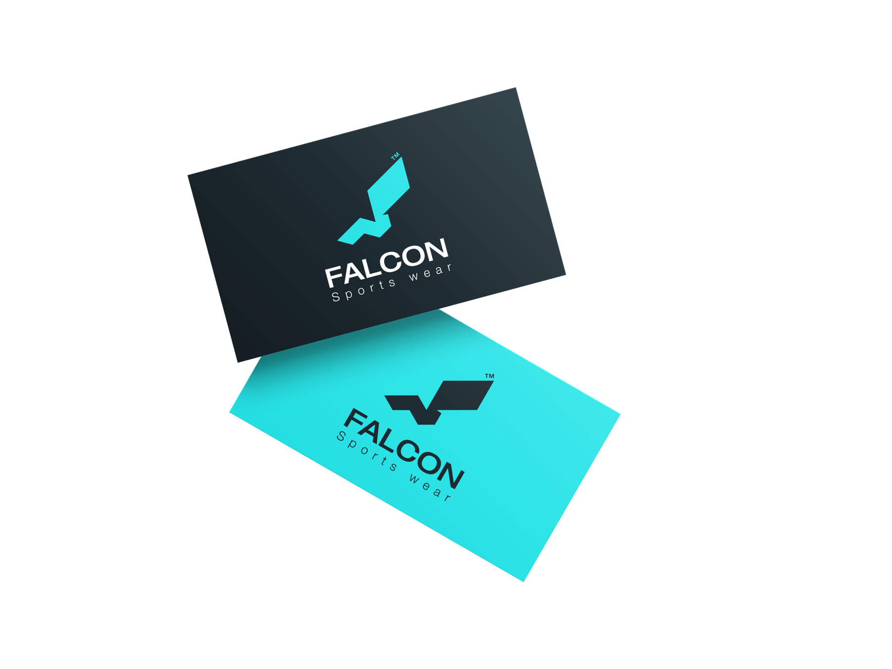
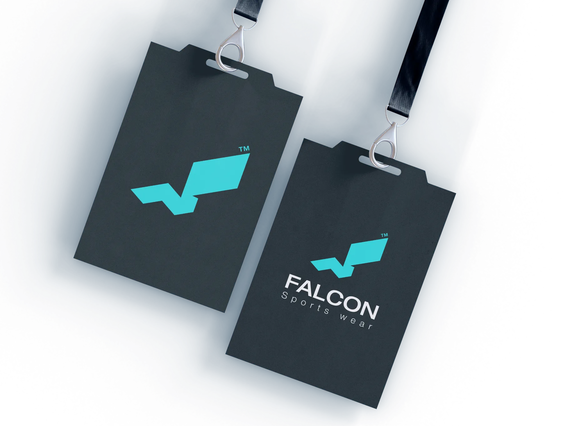
The system was applied across posters, apparel, hangtags, shopping bags, packaging, business cards, and social media. The consistent use of the mark, cyan accent, and dark base creates a unified presence across both physical and digital touchpoints.
APPAREL · PACKAGING · TAGS · RETAIL · STATIONERY · DIGITAL
06 · Brand Touchpoints
BUILT ACROSS EVERY DETAIL.
07 · Closing Gallery
A SHARP COMMERCIAL SIGNATURE.
The final identity translates the brand’s athletic character into a compact and adaptable system. Its sharp silhouette gives Falcon an immediate sense of energy, while the simple construction allows the mark to remain clear across apparel, retail communication, digital platforms, and smaller branded details.
The result is a direct commercial identity built to feel fast, recognizable, and durable—reflecting the same qualities expected from the products themselves.
BUILT TO MOVE. DESIGNED TO ENDURE.
IDENTITY · PERFORMANCE · RECOGNITION